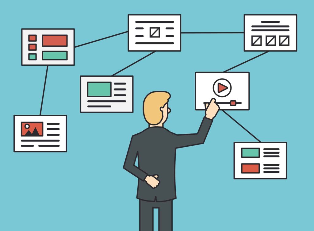
To make sure that users have a smooth experience on your website, you need to have good navigation. Clear and logical navigation makes it easy for users to find what they need, whether you’re building a website for a small business or a huge e-commerce platform. Using tried-and-true website navigation suggestions can help get people more involved, lower bounce rates, and lead them to conversion. This is how to get really good at this key design feature.
Why it’s important to navigate a website
Website navigation is more than just putting links in the right order; it’s what makes a website appealing for users. Bad navigation makes users angry, makes them leave your site more often, and degrades its credibility. Intuitive navigation, on the other hand, keeps users on your site longer and makes them want to see more.
According to research, 94% of first impressions are based on design, and navigation is a big part of that. In a few seconds, users will decide whether to stay on your site or depart. That choice is easy for them thanks to good guidance.
Important Rules for Good Website Navigation
To make a navigation system that works, you need to know and use these basic rules:
1. Keep it Simple
Visitors are confused by a menu that is too full. Make sure your navigation menus are tidy and to the point. There should only be five to seven items on the main menu, and they should only be the most important ones. This keeps you from becoming tired of making decisions and helps you focus on the most important parts of your site.
An online store might put “Home,” “Shop,” “About Us,” “Contact,” and “Cart” at the top of the list of categories. You can put extra options in a supplementary menu or footer.
2. Trust grows when things are consistent.
Users feel more in control when the navigation structure is the same on all pages. Consistency makes it easier for people to know where to look for what they want, which makes the experience better.
If your “Contact” button is in the upper right corner of your homepage, for example, make sure it stays there on all pages.
3. Put Search Front and Center
Even the best suggestions for navigating a website agree that a search bar is important. Not everyone who comes to your site will look around on their own. Some people know exactly what they want and want to find it quickly. A well-designed search bar that is easy to find in the header or near the menu does this.
4. Put mobile users first
It’s important to make navigation work well on smaller screens because most web traffic currently comes from mobile devices. For navigation that is both small and useful, use hamburger menus that can be collapsed. Make sure all links are easy to click with a finger, and don’t use menus that need to be precise to choose.
Drop-down menus that open when you tap them are an example of mobile-friendly navigation. They provide you a smartphone-friendly experience without making things too busy.
5. A logical structure always wins
Putting pages into groups makes it easier for others to understand how your site is set up. An online bakery might organize links like this, for instance:
• “Menu” goes to subcategories like “Cakes,” “Pastries,” and “Cookies.”
• “About Us” might show information about the company’s ideals, team, and history.
It also helps search engines like Google comprehend your site better when you break up information into nested structures. This will enhance your SEO.
6. Use labels that are easy to read
Don’t use words that aren’t clear, such “Services+” or “More.” Instead, utilize labels that are clear and specific. For example, a travel site may say “Destinations” instead of “Options.” The more explicit your terms are, the less confused your viewers will be.
7. Use visual cues
Using icons, colors that stand out, and hover effects can make it easier to find your way around. For instance, everyone knows what a shopping cart icon means, which makes it easier for people to find their things without having to look for them.
There are many various kinds of website navigation menus, and it’s important to pick the proper one for your site. Here are several popular sorts of navigation menus and when to utilize them:
1. Menus that go across
Horizontal menus are great for sites with simple layouts because they are usually near the top of the page. They are suitable for portfolios and small businesses with few categories.
2. Menus that go up and down
Vertical menus, which are usually on the left side, are great for blogs or ecommerce sites with a lot of categories. They assist show hierarchical content in a clear way.
3. Menus that drop down
Drop-down menus let users look through subcategories without making the design too busy if your website has a lot of content. Think over this option very carefully, as they need to be placed just right for mobile devices.
4. Menus that stick
When users scroll, sticky or fixed menus stay on the screen, making it easy to get to important navigation items. These are great for blogs and single-page portfolios that have long pages.
5. Menus in the footer
Footer menus are extra ways to navigate a website. They commonly feature contact forms, privacy rules, or sites that don’t get a lot of traffic, such FAQs or terms and conditions.
Testing and Making Navigation Better Even the best navigation systems may be improved. Here’s how to make sure yours works:
1. Testing with users
Watch real people utilize your site. Tools like heatmaps and session recordings may show you where users click and where they get stopped, which can help you find patterns.
2. Analytics for the site
The bounce rate, time spent on the site, and click-through rates can all help you figure out where your navigation might need to be changed.
3. Testing A/B
Try out different navigation layouts or labels and see how well they work. You may, for instance, see if a sticky or horizontal menu works better.
4. Checks for accessibility
Remember the basics, including the size of the font, the contrast between colors, and how to navigate with the keyboard. These changes make sure that everyone can utilize the site, no matter their skill level.
Things to Avoid When Navigating: Here are some things that can make it hard for consumers to navigate:
• Hard-to-Use Drop-Down Menus: Users can get confused if there are too many layers, especially on mobile devices.
• Pages that aren’t needed: Every page should have a reason for being there. Don’t make pages that make it hard to navigate.
• No Search Functionality: Not having a search bar can make users who want rapid answers angry.
• Putting too many alternatives on the menu: Too many choices can make it hard to decide. Keep it simple.
Navigation that works well is a continual process. You can make browsing easier by focusing on simplicity, consistency, and user-friendly design. Use these recommendations for navigating your website, test your setup, and make changes as needed. Keep in mind that people are far more likely to stay interested, explore more, and become loyal customers if they can simply locate what they want.

